Selling the "Dream": Luxury Branding for a Premium Developer
Client Profile: A Boutique Real Estate Developer in Gulshan.
Scope: Project Logo, Hoarding, and Sales Kit.
Goal: Sell apartments worth 10 Crores+.
1. The Challenge
They weren’t selling just “apartments”; they were selling a lifestyle. The standard real estate branding (Red/Green text, building photos) looked too common. They needed to appeal to the elite 1%.
2. The Strategy: “The Art Gallery Approach”
We removed the “Real Estate” feel and made it look like a luxury fashion house.
- The Name: Naming the building “The Opus” instead of “ABC Heights” to give it weight.
- Minimalism: Used a lot of “Negative Space” (White space) in brochures. In luxury, less information = more exclusivity.
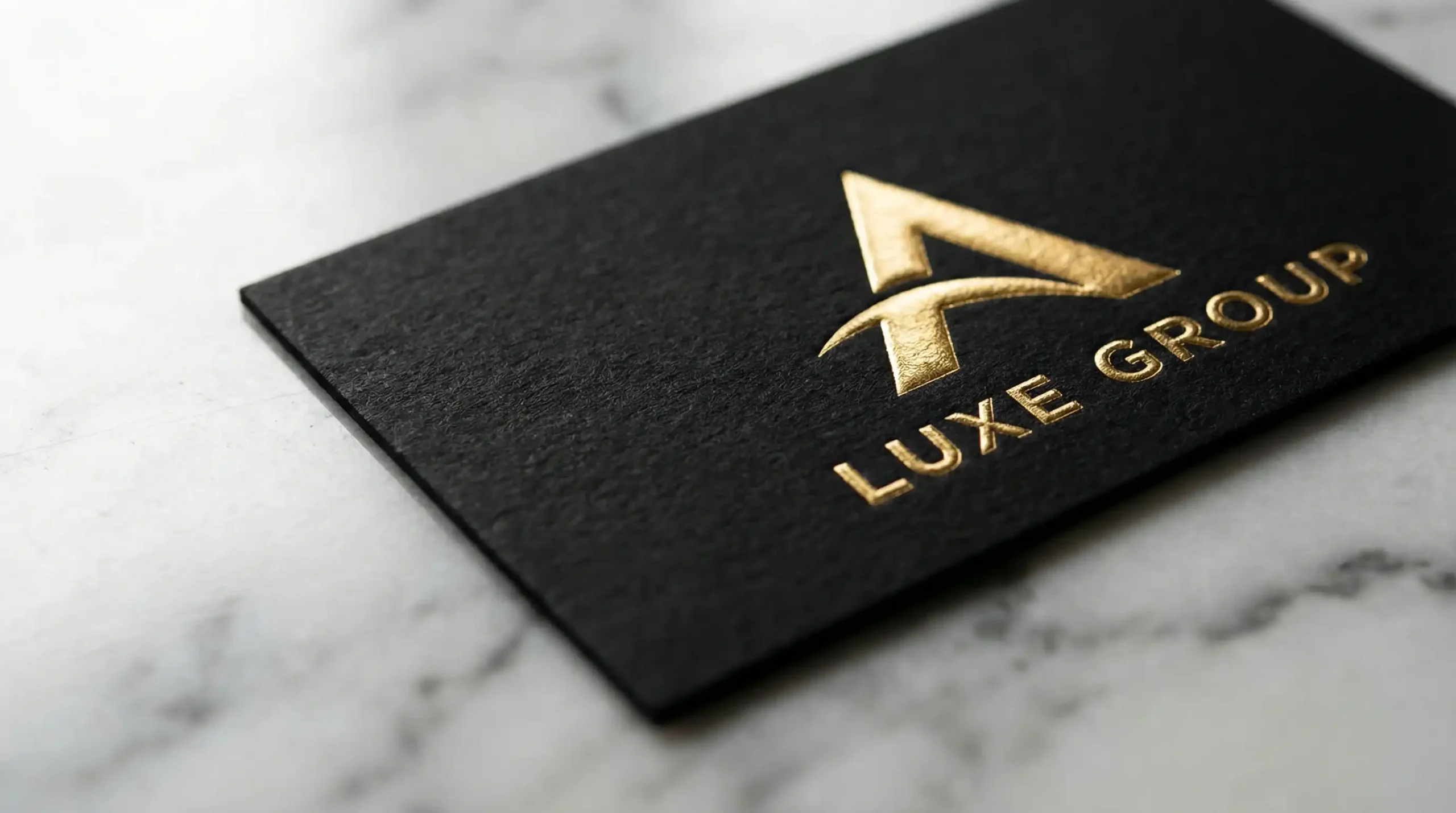
- Tactile Branding: We focused on print quality. The brochure wasn’t glossy paper; it was textured matte paper with Gold Foil Embossing. The business cards were extra thick. Touching the brand felt expensive.
3. The Results
- Sales Velocity: Sold 40% of units “Off-Plan” (before construction started) just based on the brand presentation.
- Price Premium: The brand perception allowed them to charge 15% more per square foot than the building next door.
- Prestige: Became the talk of the town among the targeted High-Net-Worth social circles.