Converting a Generic Developer into a Luxury Real Estate Icon
Client Industry: Real Estate & Development (High-End Segment)
Service Stack: Corporate Rebranding | Visual Identity System | Brand Strategy
Timeline: 4 Months
1. THE EXECUTIVE SUMMARY
In the premium real estate market of Bangladesh, Perception is Reality.
Our client, a 15-year-old construction firm, possessed prime land assets in Dhaka. However, they faced a severe valuation problem. Wealthy investors and NRBs (Non-Resident Bangladeshis) were hesitant to book apartments because the company’s image looked “dated” and “unorganized.”
They were charging market rates, but they wanted to charge a Premium Price Tag. To do that, they needed to look like a World-Class Institution, not just a local builder.
2. THE DIAGNOSIS: THE “GENERIC” TRAP
We analyzed their touchpoints and found a disconnect between their Product and their Presentation:
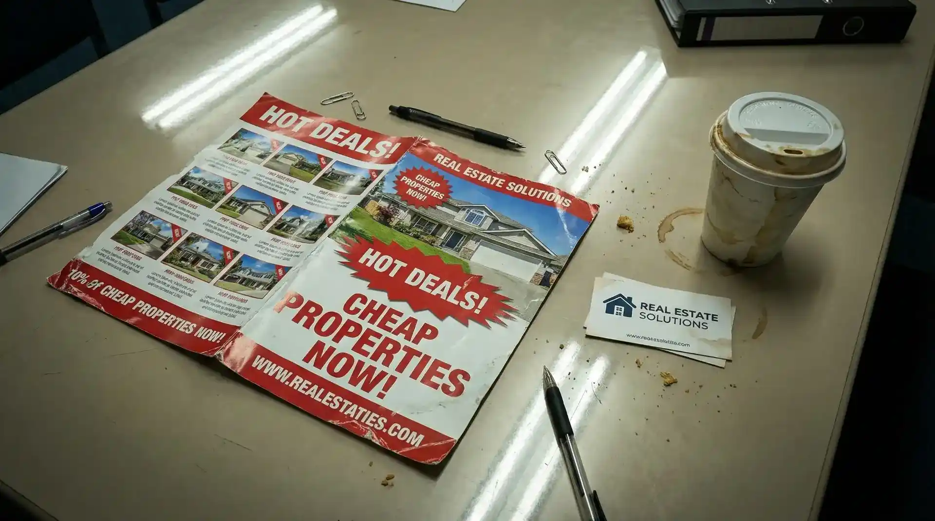
- Visual Noise: Their logo used clichéd “Building Roof” icons and harsh red/green colors that screamed “Low-Cost Housing,” confusing their luxury target audience.
- Collateral Chaos: Their sales brochure was a chaotic mix of mismatched fonts and pixelated images. It failed to communicate the lifestyle promise of a 5-Crore Taka apartment.
- Inconsistent Voice: Every department used a different version of the logo, signalling internal disorganization to external investors.
3. THE HENA TECHNOLOGY STRATEGY
We did not just “redesign a logo.” We engineered a Psychological Identity System.
Phase A: The Strategic Shift (Minimalism = Luxury)
We stripped away the clutter. In luxury marketing, Less is More.
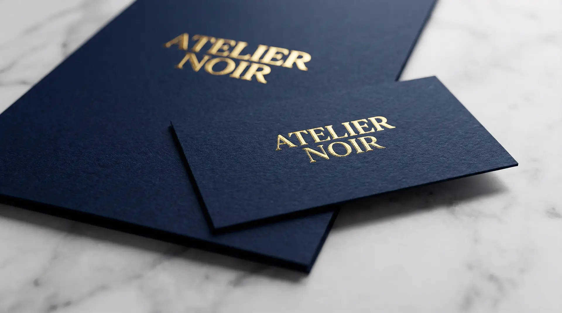
We adopted the “Silent Confidence” archetype. We moved away from literal house icons to an abstract, typographic logo mark. We selected a color palette of Deep Midnight Blue (Authority) paired with Champagne Gold Foil (Wealth).
Phase B: The Brand Book (The Rules of Consistency)
We developed a comprehensive 60-page Brand Guideline Book. It wasn’t just colors; it was engineering. We defined exact “Safe Zones” for the logo on massive construction hoardings versus tiny mobile screens. We chose a licensed, geometric Sans-Serif font family specifically optimized for readability on investor prospectuses.
4. THE FINANCIAL IMPACT: VALUATION UPLIFT
The rebranding acted as a multiplier on their sales efforts. The new identity bridged the gap between their construction quality and their market perception.
- Price Elasticity:The client successfully launched their new Gulshan project at a 15% Higher Price Per Sqft than competitors, simply because the brand looked elite.
- The “Unboxing” Effect:The Sales Team reported that when they handed the new Gold-Embossed Sales Kit to clients, the conversion rate for site visits jumped by 40%.
- Talent Attraction:Top architects and sales talent started applying to work with the company, attracted by the modern, global image.