Trust at First Sight: Designing a Credible Identity for a Fintech Startup
Client Profile: An Emerging Mobile Wallet / Fintech App.
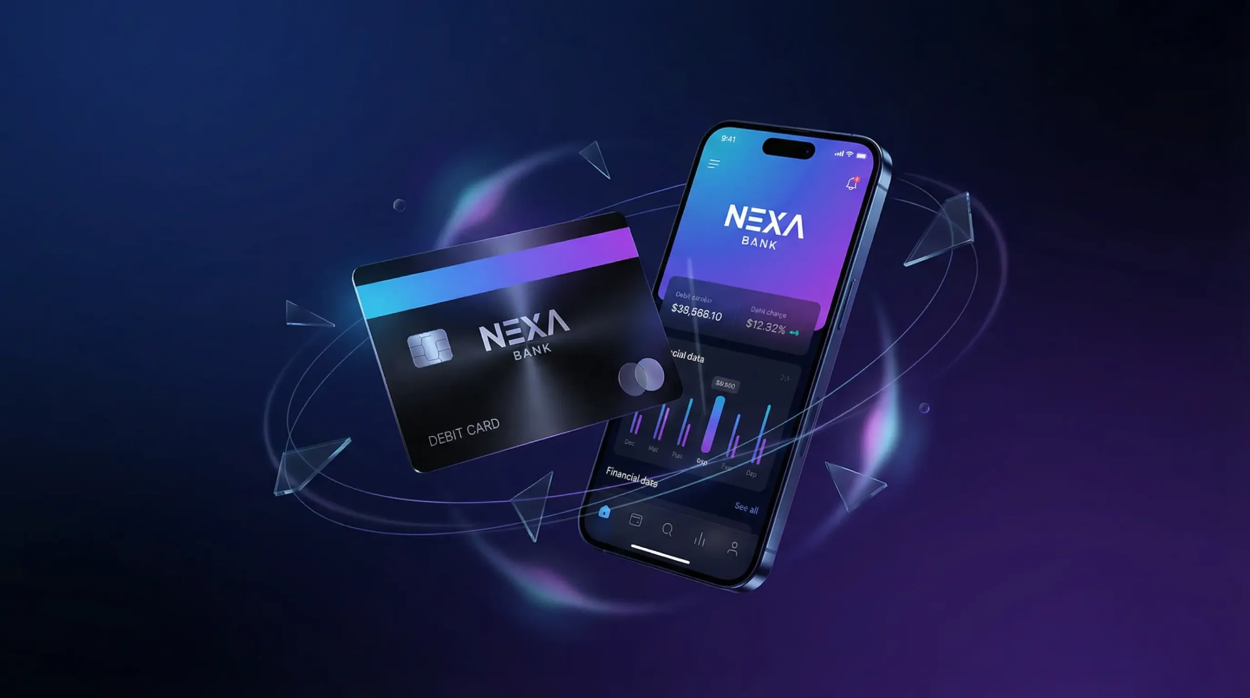
Scope: Naming, Logo, UI/UX Visual Language.
Goal: Look secure enough for people to deposit their money.
1. The Challenge
A “new” bank or wallet is scary. If the branding looks cheap, users assume their money will disappear. The client needed to look as established as Standard Chartered, but as user-friendly as Uber.
2. The Strategy: “Friendly Security”
We needed to balance Fun (to attract Gen-Z) and Serious (to keep trust).
- The Symbol: We designed an abstract symbol representing “Shield” (Security) and “Pixel” (Digital).
- Typography: Custom-rounded typeface. Rounded corners feel friendlier and less aggressive than sharp edges.
- Brand Voice: Defined the tone of voice as “Your Financial Friend.” Not a stiff banker, but a smart advisor.
- Visual Consistency: Applied this look across the App UI, Facebook Ads, and Credit Cards to ensure the user never felt they left the ecosystem.
3. The Results
- App Stickiness: The cohesive visual experience contributed to a high retention rate.
- Valuation: The strong brand identity was explicitly mentioned in their Pre-Series A investment deck as a “Defensible Asset.”
- User Growth: Acquired 100,000 users in the first quarter, with feedback praising the “International look” of the app.